

remote control
precedents ...
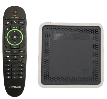
After the acquisition of CANAL+ by Telefónica in 2015, the satellite TV platform (with the iPlus set-top box and its remote control) will now coexist with Movistar's ipTV. Each platform will use its own decoder, remote control and interface.
In 2018, it was decided to change the ipTV interface, which entailed changing the decoder (for a more powerful one that could handle the new UI and be compatible with UHD and other services) and therefore its remote control.
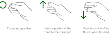
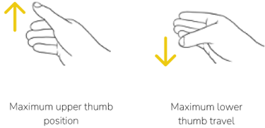
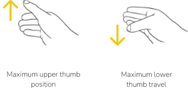
The mobility of the thumb while holding an object (remote control) was analysed to define the different reach zones and to distribute the buttons accordingly.
After this analysis, three zones were defined: natural, anatomical and forced.
ergonomics ...
The whole area outside the anatomical movement of the thumb is a strain on the user and will force the hand to move in order to change its location on the remote control. It is by far the most uncomfortable and unnatural area and should be omitted or reserved for buttons that are rarely used.
natural movement ...
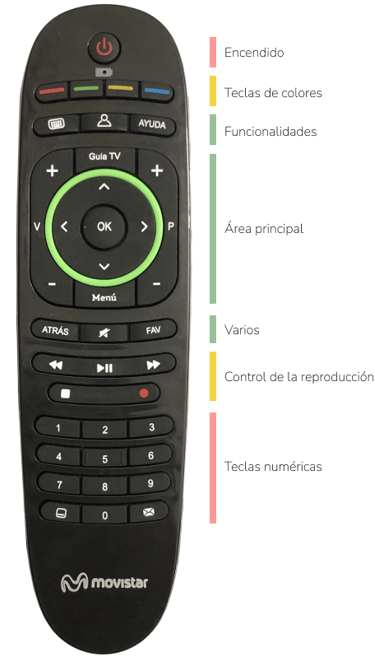
When analysing the previous remote control, we found two main problems. The first is its complexity, the number of direct keys and iconography used. The second is its layout, delegating to a second level the numeric keypad (widely used for linear television consumption) and prioritising many shortcuts (little used).
previous remote control ...
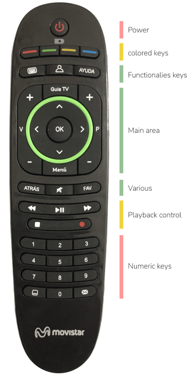


• Due to the complexity of the interface, coloured keys were defined, inherited from the teletext era. In some cases this duplicates keys, such as the red key and the record key, which do the same thing.
• The volume key and channel key do not follow the standard and are integrated with the central crosshair, adding more complexity and making it easier to make wrong keystrokes.
• Keys are difficult to interpret.
• The finish gives the impression of a cheap product.
• Infrared, which makes it difficult to use if it is not aimed at the decoder (sometimes hidden or inaccessible).

Number of keys: 39
Shortcuts: 13
power ...
On/Off button of the decoder.
coloured keys ...
They are used as shortcuts to certain functionalities (record, view from startup, filters, etc.)
functionalities keys ...
These allow direct access to some of the platform's functionalities (keyboard, profile and help).
main area ...
Here you will find the scroll wheel with the volume keys, the channel change keys, and the access keys to the Guide and the front page.
various ...
The Back key, mute, and an access to your favourites list are grouped together.
playback control ...
They allow you to control the playback of content.
numeric keys ...
Numeric keypad for channel tuning and access to subtitles and messages.

forzed movement ...
anatomical movement ...
briefing ...
A new remote control is required that meets the following criteria:


Make it as easy to use as possible without sacrificing the platform's main functionalities. Eliminate rarely-used keys and reorganise the necessary ones to facilitate intuitive use of the remote control without having to take your eyes off the TV.

Add value to the product. To make the customer get more out of a product that is included in the commercial offer. Add functionalities (microphone, backlit keyboard, Bluetooth connection, etc.) Improve finishes and finishes.
The aim is to prioritise navigation, as the start of the decoder will be on the front page instead of on the live channels. The aim is to boost the consumption of on-demand content by giving them visibility (as a very high percentage of customers only consume live televisión, many of them out of ignorance).
The first issue to consider is to define the complexity of the remote control. As many of the functionalities are more accessible in the interface, it is less necessary to include them physically in the remote control itself.
The main limitation is the numeric keypad. Due to the predominant customer profile of the platform (elderly people with little knowledge of technologies who consume almost exclusively conventional television), it was decided to keep it, serving also as a way of escaping from the new interface if they do not feel comfortable with it.
proposals ...
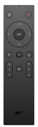
proposal 1 ...
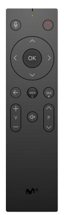
The number of buttons is simplified as much as possible to focus on navigation, volume and channel control. Increasingly standard design in smartTVs.
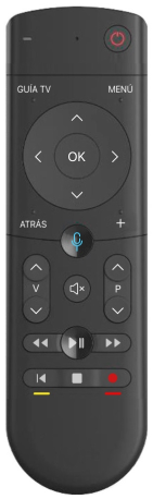
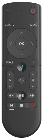
• Lack of numeric keypad (limiting quick channel tunning).
• Very extreme changeover (24 keys less than the current one).
proposal 2 ...
Playback control keys are added to the previous proposal and access to the microphone is prioritised to encourage its use.
• Lack of numeric keypad (limiting quick channel tunning).
• Unusual size which makes it difficult to hold the remote control and press the lower keys.
proposal 3 ...
The numeric keypad is added in order to maintain the functionality of the current controller and to take advantage of the standard dimensions.
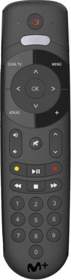
• The numeric keypad is very displaced, making multiple key pressing very difficult.
• Very large keys.
final proposal ...
The distribution of the keys has been restructured to favour access to the navigation pad, de-prioritising the playback control keys and eliminating most of the shortcuts to secondary sections or functionalities). Priority has been given to the use of different textures to make it easier to recognise them without having to look at the controller.
Number of keys: 32 (-7)
Shortcuts: 3 (-10)
• Simplification of the number of keys, eliminating up to 7 compared to the previous version, although 3 new ones have been added (microphone, back to start and Apps).
• Disappearance of the coloured keys, but maintaining colour support for the two most used keys to facilitate the transition.
• Use of different textures, shapes and volumes on the keys to simplify their use (without looking at the controller). More ergonomic and with better finishes (premium product).
• Backlit keys, which light up when movement is detected.
• Built-in microphone to facilitate voice interaction.
• Dual and universal remote control, by infrared and Bluetooth, allowing you to control both TV and decoder without having to point.

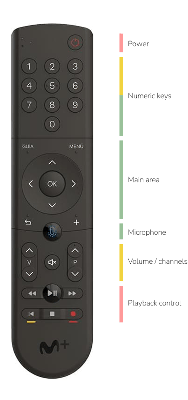
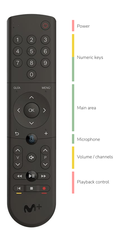
power ...
Decoder on/off button
numeric keypad ...
Numeric keypad for channel tuning.
microphone ...
Activates the use of the microphone on the remote control.
main area ...
Here you will find the scrolling crossbar with the back and access to the Guide, homepage and Apps.
volume / channels ...
Control del volumen (con mute) y cambio de canal.
playback control ...
They allow you to control the playback of content.
outcomes ...
The objectives set are achieved. Users highly value the new features added and consumption of on-demand content increases without penalising television consumption.
• Increased appreciation of the quality of finishes.
• More intuitive use (without having to look).
• Less need to use keys located in less accessible areas as these actions can be carried out easily on the interface itself.
• The backlighting is rated very positively.
• High number of requests to change from the previous remote control to this one.
• High percentage of Bluetooth activation.
• More ergonomic and comfortable position (no sliding).
• Absence of complaints about the elimination of keys included in the other remote control.
• The "+" key is confusing (imposed by technical management). Users do not understand what it does and it also forces us to remove this symbol from the sound keys (standard).
Alternatives are proposed (but discarded).
rediseño del mando
punto de partida ...
Tras la compra de CANAL+ por parte de Telefónica en el 2015, la plataforma de TV satélite (con el desco iPlus y su mando) pasa a convivir con la ipTV de Movistar. Cada plataforma utilizará su propio descodificador, mando e interfaz.
En el año 2018 se decide cambiar la interfaz de ipTV, lo que conlleva el cambio de descodificador (por uno más potente que pudiera mover la nueva UI y ser compatible con UHD y otros servicios) y por lo tanto de su mando.
Se analizó la movilidad del dedo pulgar mientras se sujeta un objeto (mando) para definir las diferentes zonas de alcance y distribuir los botones según las mismas.
Tras el análisis se definieron tres zonas: La natural, la anatómica y la forzada.
ergonomía ...
Todo el área fuera del movimiento anatómico del pulgar implica un esfuerzo para el usuario y forzará el movimiento de la mano para cambiar su ubicación en el mando. Es, con diferencia, la zona más incómoda y antinatural y debería omitirse o destinarla para aquellos botones de escaso uso.
movimiento natural ...
Al analizar el mando anterior encontramos dos problemas principales. El primero es la complejidad del mismo, la cantidad de teclas directas e iconografía usada. El segundo es su distribución, delegando a un segundo nivel el teclado numérico (muy usado para el consumo de televisión lineal) y priorizando muchos accesos directos (poco usados).
mando actual ...


• Debido a la complejidad de la interfaz, se definieron teclas de colores, heredadas de la época del teletexto. En algunos casos eso duplica teclas, como la tecla roja y la tecla de grabar, que hacen lo mismo.
• La tecla de volumen y de canal no siguen el estándar y se integran con la cruceta central, añadiendo más complejidad y facilitando las pulsaciones erróneas.
• Teclas difíciles de interpretar.
• Los acabados dan sensación de ser un
producto barato.
• Mando por infrarrojos, que dificulta su uso si no se apunta al descodificador (a veces oculto o poco accesible).
Número de teclas: 39
Accesos directos: 13
encendido ...
Tecla de encendido / apagado del descodificador.
teclas de colores ...
Se utilizan como accesos directos a ciertas funcionalidades (grabar, ver desde el inicio, filtros, etc.)
teclas de funcionalidades ...
Permiten acceder, de forma directa, a algunas funcionalidades de la plataforma (teclado, perfil y ayuda).
área principal ...
En ella se encuentra la cruceta de desplazamiento con las teclas de volumen, de cambio de canal, y las teclas de acceso a la Guía y a la portada.
varios ...
Se agrupa la tecla Atrás, mute y un acceso a tu lista de favoritos.
control de la reproducción ...
Permiten controlar la reproducción de contenidos.
teclas numéricas ...
Teclado numérico para sintonizar canales y acceso a subtítulos y mensajes.


movimiento forzado ...
movimiento anatómico ...


briefing ...
Se requiere un nuevo mando que cumpla los siguientes criterios:
Hacer su uso lo más sencillo posible sin renunciar a las principales funcionalidades de la plataforma. Eliminar teclas poco usadas y reorganizar las necesarias para facilitar el uso intuitivo del mando sin necesitar apartar la vista del televisor.
Aportar valor al producto. Que el cliente valore y saque más partido a un producto que tiene incluido en su oferta comercial. Añadir funcionalidades (micrófono, teclado retroiluminado, conexión Bluetooth, etc.) Mejorar acabados y terminaciones.
Se quiere priorizar la navegación, ya que el arranque del descodificador pasará a ser en la portada en lugar de en los canales en directo. Con ello se quiere impulsar el consumo de contenidos a la carta dándoles visibilidad (ya que un porcentaje muy alto de clientes sólo consumen canales, muchos por desconocimiento).
El primer tema a valorar es definir la complejidad del mando a distancia. Al ser más accesibles en la interfaz muchas de las funcionalidades, se hace menos necesario incluirlas en el propio mando de forma física.
La principal limitación es el teclado numérico. Debido al perfil de cliente mayoritario de la plataforma (personas de edad avanzada y poco conocimiento de las tecnologías que consumen casi en exclusiva la televisión convencional) , se decide mantenerlo, sirviendo también como una forma de escape de la nueva interfaz si no se sienten cómodos con ella.
propuestas ...
propuesta 1 ...
Se simplifica al máximo el número de botones para centrarlo en la navegación y en el control del volumen y canales. Diseño cada vez más estándar en smartTV.
• Falta del teclado numérico (limitando el cambio rápido de canal).
• Cambio muy extremo (24 teclas menos que en el actual).
propuesta 2 ...
Se añaden a la anterior propuesta las teclas de control de la reproducción y se prioriza el acceso al micrófono para fomentar su uso.
• Falta del teclado numérico (limitando el cambio rápido de canal).
• Tamaño inusual que complica la sujeción del mando y la pulsación de las teclas inferiores.
propuesta 3 ...
Se añade el teclado numérico a la segunda propuesta para mantener la funcionalidad del mando actual y aprovechar las dimensiones estándar.
• El teclado numérico queda muy desplazado, dificultando mucho la pulsación múltiple de las teclas.
• Teclas muy grandes.
diseño final ...
Se reestructura la distribución de las teclas para favorecer el acceso a la cruceta de navegación, despriorizando las de control de reproducción y eliminando la mayoría de accesos directos a secciones o funcionalidades secundarias). Se prioriza el uso de diferentes texturas para facilitar el reconocimiento de las mismas sin necesidad de mirar el mando.
Número de teclas: 32 (-7)
Accesos directos: 3 (-10)
• Simplificación del número de teclas, eliminando hasta 7 respecto al anterior pese a haber añadido 3 nuevas (micrófono, volver al principio y Apps).
• Desaparecen las teclas de colores, pero se mantiene un apoyo de color a las dos más usadas para facilitar la transición.
• Utilización de diferentes texturas, formas y volúmenes en las teclas para simplificar su uso (sin mirar el mando). Más ergonómico y con mejores acabados (producto premium).
• Teclas retroiluminadas, que se encienden al detectar movimiento.
• Micrófono incorporado para facilitar la interacción vocal.
• Mando dual y universal, por infrarrojos y Bluetooth, permitiendo controlar tanto televisión como descodificador sin tener que apuntar.
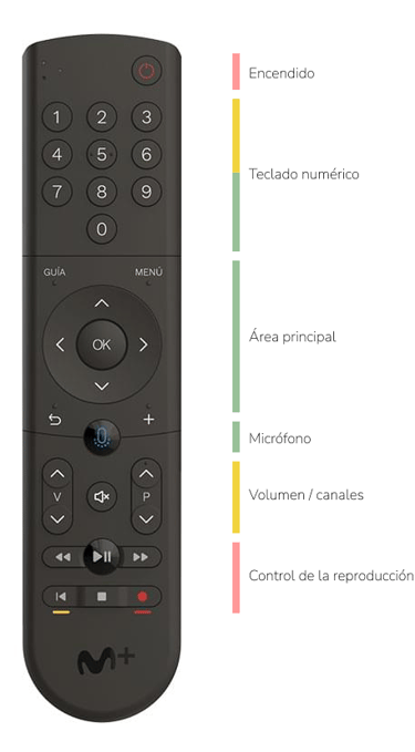
encendido ...
Tecla de encendido / apagado del descodificador.
teclado numérico ...
Teclado numérico para sintonizar canales.
micrófono ...
Activa el uso del micrófono del mando.
área principal ...
En ella se encuentra la cruceta de desplazamiento con el atrás y accesos a la Guía, portada y Apps.
volumen / canales ...
Control del volumen (con mute) y cambio de canal.
control de la reproducción ...
Permiten controlar la reproducción de contenidos.
resultado ...
Se alcanzan los objetivos marcados. Los usuarios valoran mucho las nuevas funcionalidades añadidas y aumenta el consumo de contenido bajo demanda sin penalizar el consumo de televisión.
• Aumenta la apreciación de las calidades de acabados.
• Uso más intuitivo (sin tener que mirar).
• Menos necesidad de utilizar teclas ubicadas en zonas menos accesibles al poder realizarse esas acciones en la propia interfaz de forma sencilla.
• La retoiluminación es valorada de forma muy positiva.
• Gran número de peticiones de cambio del mando anterior por este último.
• Porcentaje alto de activación del Bluetooth.
• Posición más ergonómica y cómoda (no es escurre).
• Ausencia de quejas por la eliminación de teclas incluidas en el otro mando.
• La tecla “+” es confusa (imposición de la dirección técnica). Los usuarios no entienden qué hace y además nos obliga a quitar ese símbolo de las teclas de sonido.
Se proponen alternativas (pero se descartan).
caso de estudio 1
© Copyright Rogelio Casado 2025. All rights reserved.

