


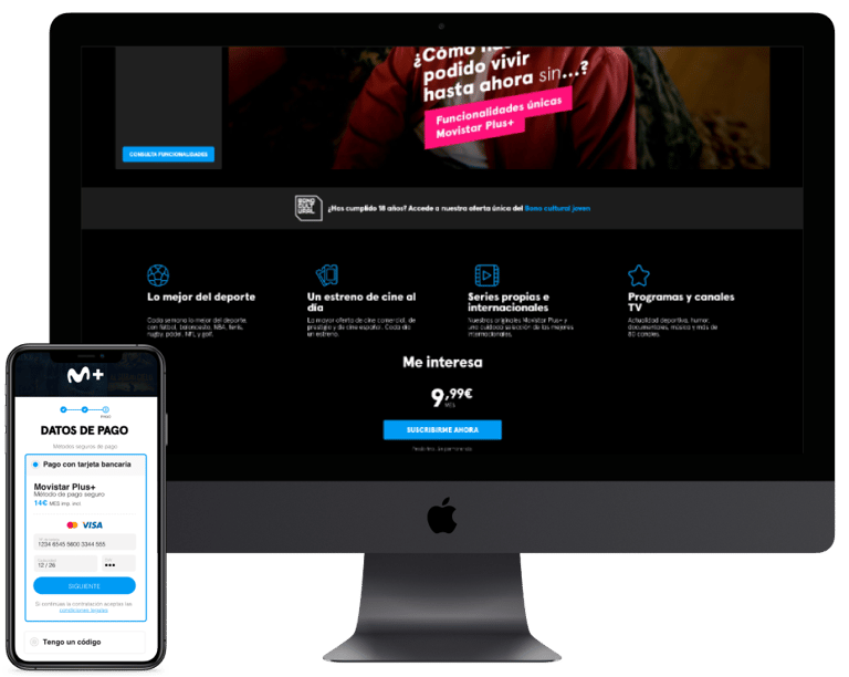
purchase funnel...
In 2024, due to the continued decline in digital TV customers caused by high competition in the sector, the Product Managers (PMs) proposed launching a new product independent of the group’s other services. This strategy aimed to reduce the price, make it more competitive, and attract more customers.
Role: Lead Product Designer
Year: 2024
Context & Background...
After Telefónica’s acquisition of CANAL+ in 2015, the company’s satellite and streaming television service became part of the Spanish operator’s offering, always linked to communications (landline, internet connection, and mobile lines).
This integration model complicated the browsing experience for available video and TV content, increased time spent on the page and churn rate, and resulted in a very low conversion rate (CR). Additionally, it raised the product’s final price, affecting its competitiveness.
To respond to the growing competition in the audiovisual sector, a commercial offering was launched independently from other Movistar services. This change aimed to reduce the product’s commercial price, improve its market positioning, and regain customer share.
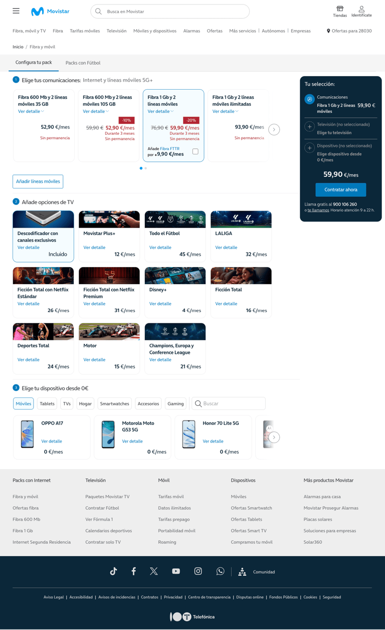
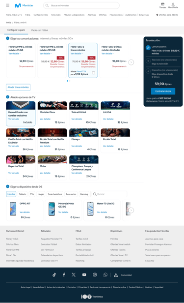
Screen for selecting the Movistar offer with the different available TV packages.
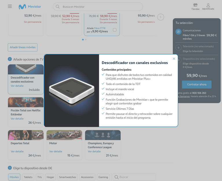
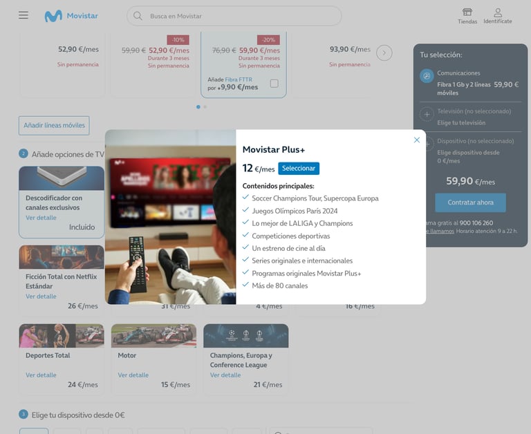
Information about one of the available packages, including very brief details and not clearly showing the type of content included in the offer.
Information about one of the TV packages.
An Agile team was formed where the Product Owner (PO), Scrum Master, stakeholders (representing different departments), and members from all involved teams defined:
agile team Creation...
Project expectations.
Vision and objectives.
Roles and responsibilities of each team member.
Methodology and tools to be used.
Initial scope and backlog.
Work dynamics and meetings.
To make the streaming service competitive, it was marketed as a standalone product, allowing more flexible access for customers and increasing sales.
defining objectives...
Highligh the content offering and its quality.
To achieve this, the following key objectives were set:
Provide a fast and simple hiring process.
Improve metrics compared to the Movistar website.



Achieve a score above 80.
SUS
NPS
Improve current rating.
CHURN
SEO
Reduce churn rate.
Increase visits to the landing page.
In this phase, KPIs (Key Performance Indicators) and success metrics were defined with stakeholders.
empathizing with users...
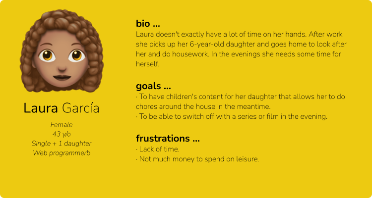
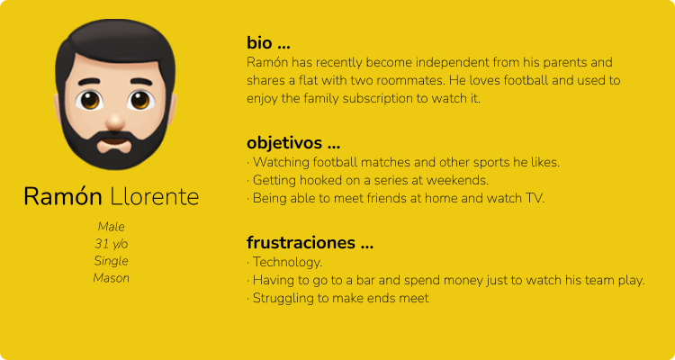
User groups were studied and defined through the creation of empathy maps and user personas. Then, using user stories and user journeys, their pain points were identified.
Research and Analysis...
Studies were conducted to better understand users, identify their needs and frustrations, detect friction points, and analyze competitors.
benchmarking...







The subscription processes of competing platforms were analyzed to identify best practices and differentiating factors in the market. Commercial strategies, conversion and retention processes, as well as SEO and digital marketing strategies, were also evaluated.
Analysis of different commercial offers, conversion and retention processes, and applied techniques.
Improve SEO to attract organic traffic and define an effective marketing strategy together with the Communication department.
2. Exploration...
1. traffic...
3. Conversion...
4. Retention...
Clearly highlight the breadth of the content offering and its quality.

Create a quick checkout to encourage fast purchases, removing friction and optimizing the available payment methods.
defining the funnel...
A commercial funnel was designed, focusing on four key stages:
Implement retention measures to prevent cancellations and gather user feedback.
flows & wireframes ...
User flows, wireframes, and mockups were created to define the user experience. Reviews were conducted with stakeholders to ensure technical feasibility and make adjustments based on existing constraints. Once modifications were approved, the user interface design progressed.
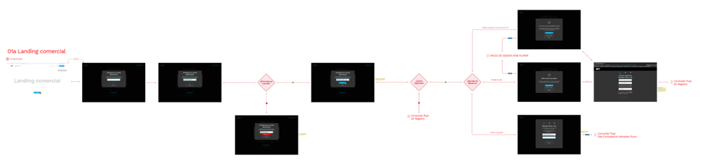


User flow considering both new and existing customers.
One of many presented navigation flows. This one details different scenarios based on customer type.
2. exploration...
A commercial landing page (www.movistarplus.es) was developed to showcase the content included in the product, with a special focus on live sports and TV—key differentiators from the competition.


The above-the-fold area was reserved to display the price, CTA, and a carousel featuring the week's highlighted content.
The most relevant sports event of the day/week was prioritized as the main commercial attraction, with a Call to Action encouraging impulse/emotional purchases.
We display all the channels included in the offer to highlight the great diversity of content available and some of the most relevant features of the product.
A sports calendar was included to clarify which events were available with this offer. To reinforce product value, key features were listed, emphasizing content variety and quality.
Groupings by categories are shown to emphasize the quality of the content and showcase the vast offering and diversity of the content.
The functionalities included in this product are listed to highlight its value. No competitor offers such diversity and quality of content.
Although the CTA remains visible in the floating menu, the promotional offer is reiterated after showcasing the main selling points.
Frequently Asked Questions were added to address doubts and build trust in the purchase process.
Informative footer that helps with the site's SEO.

3. conversion...
Despite the complexity of multiple platforms and databases used within the company, efforts were made to ensure the process was as transparent as possible for users, minimizing the required information and completion time.
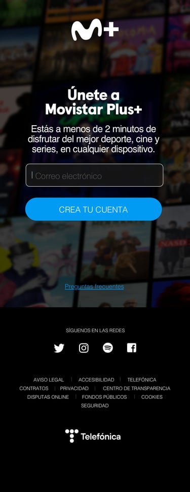
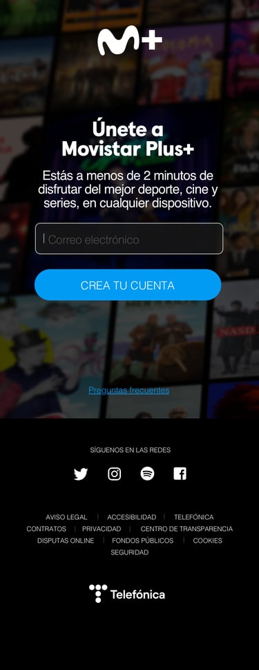
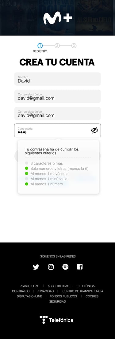
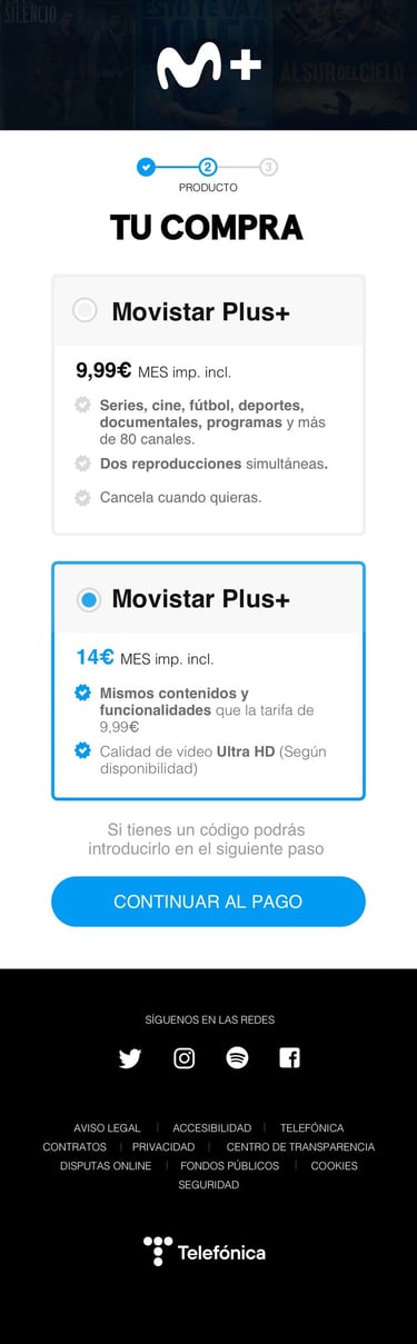
Email is requested as the first step to simplify the purchase process if the user is already registered.
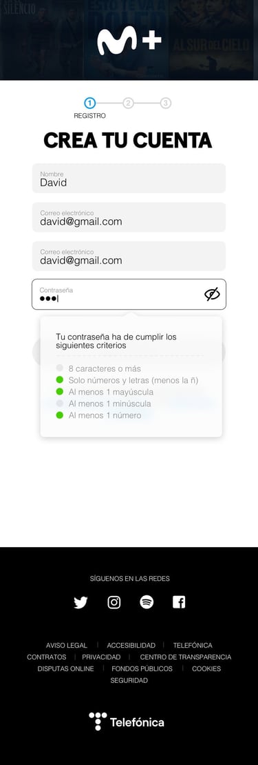
If it is a new customer, the minimum required information is requested. The first email field is pre-filled with the one entered in the previous window, but confirmation is required because if it is not correct, the user will not be able to access the service or receive communications.
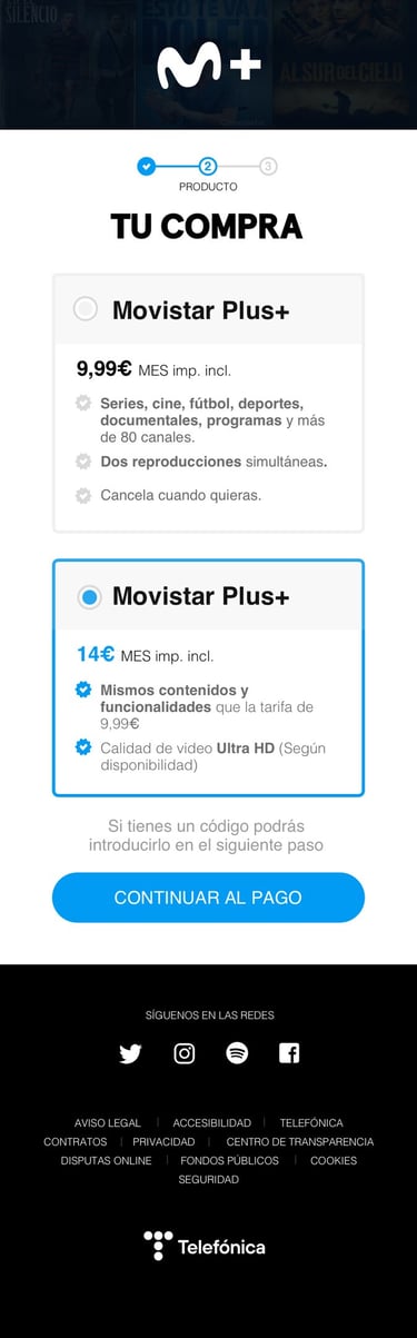
A scalable structure was designed to allow future product evolution with more commercial options.
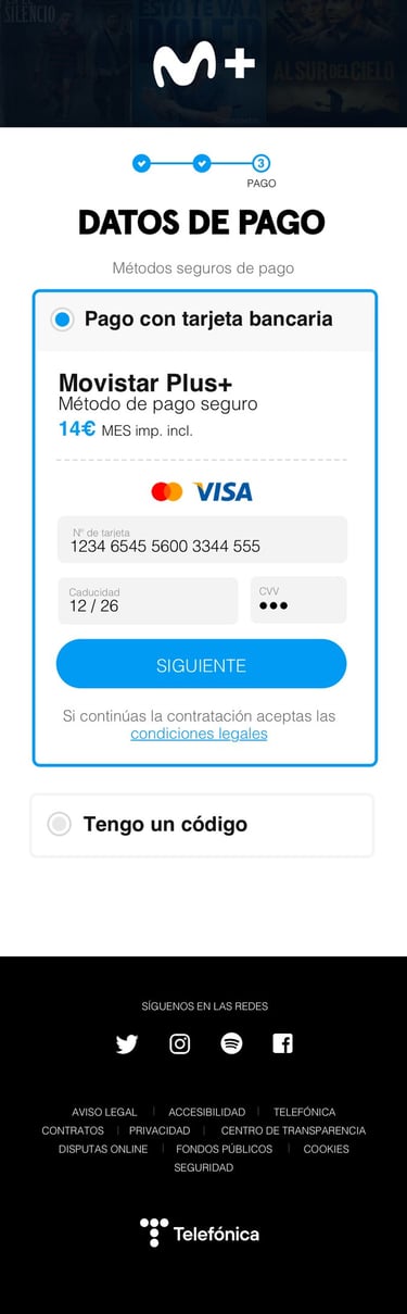
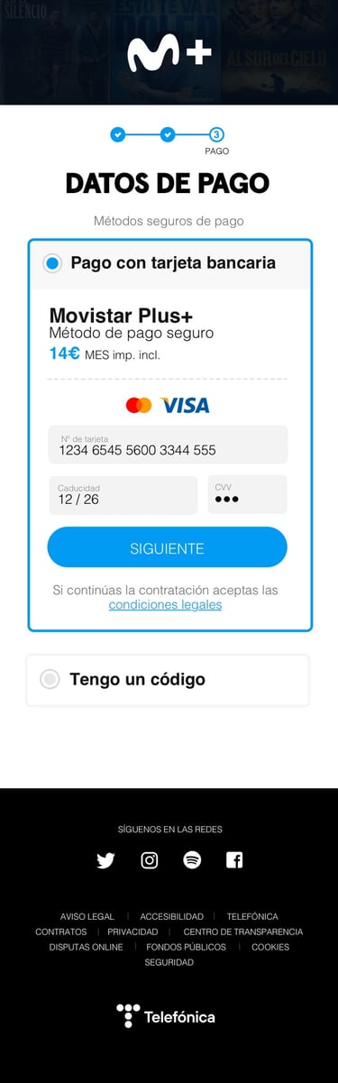
In the final step, the payment gateway and promotional code redemption were enabled.
PROTOTyping...
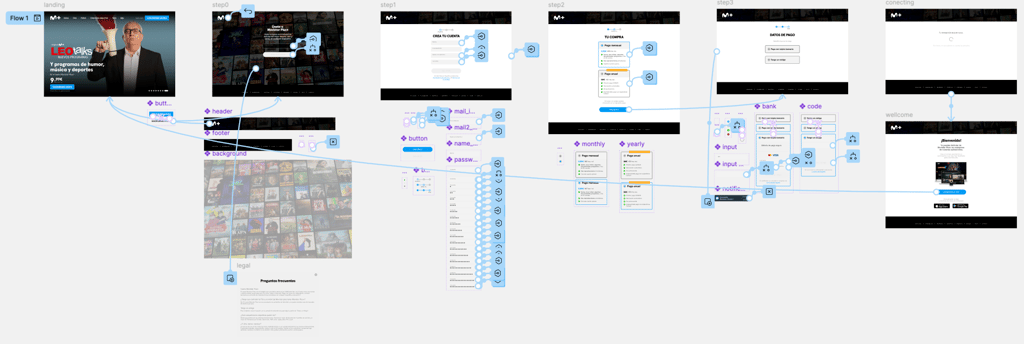
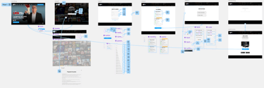
Functional prototypes of the commercial landing page and the purchase process are created for usability studies. These prototypes validate interaction, usability, and the texts and information displayed throughout the process to make necessary corrections and refine the experience.
Some, like the one shown here, are technically very complex, as writing and validating fields in prototypes is challenging. This is solved with advanced use of variables and conditionals.
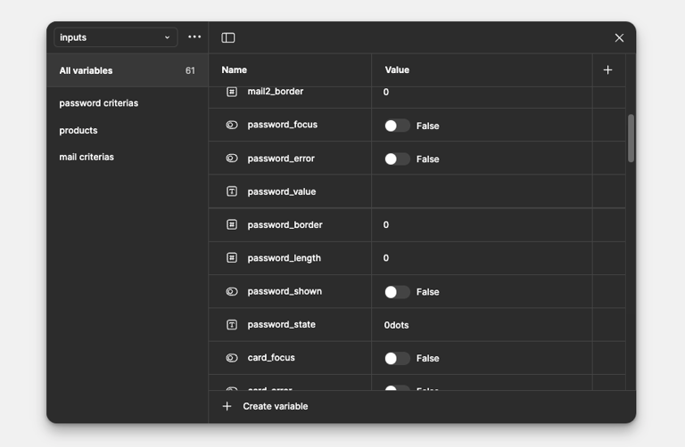
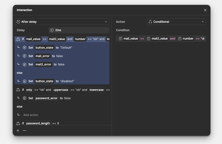
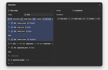
Some example screens of variable and conditional definitions.
A retention strategy is implemented during the cancellation process and for non-renewed subscriptions, applying discounts and providing feedback surveys.
4. retention...
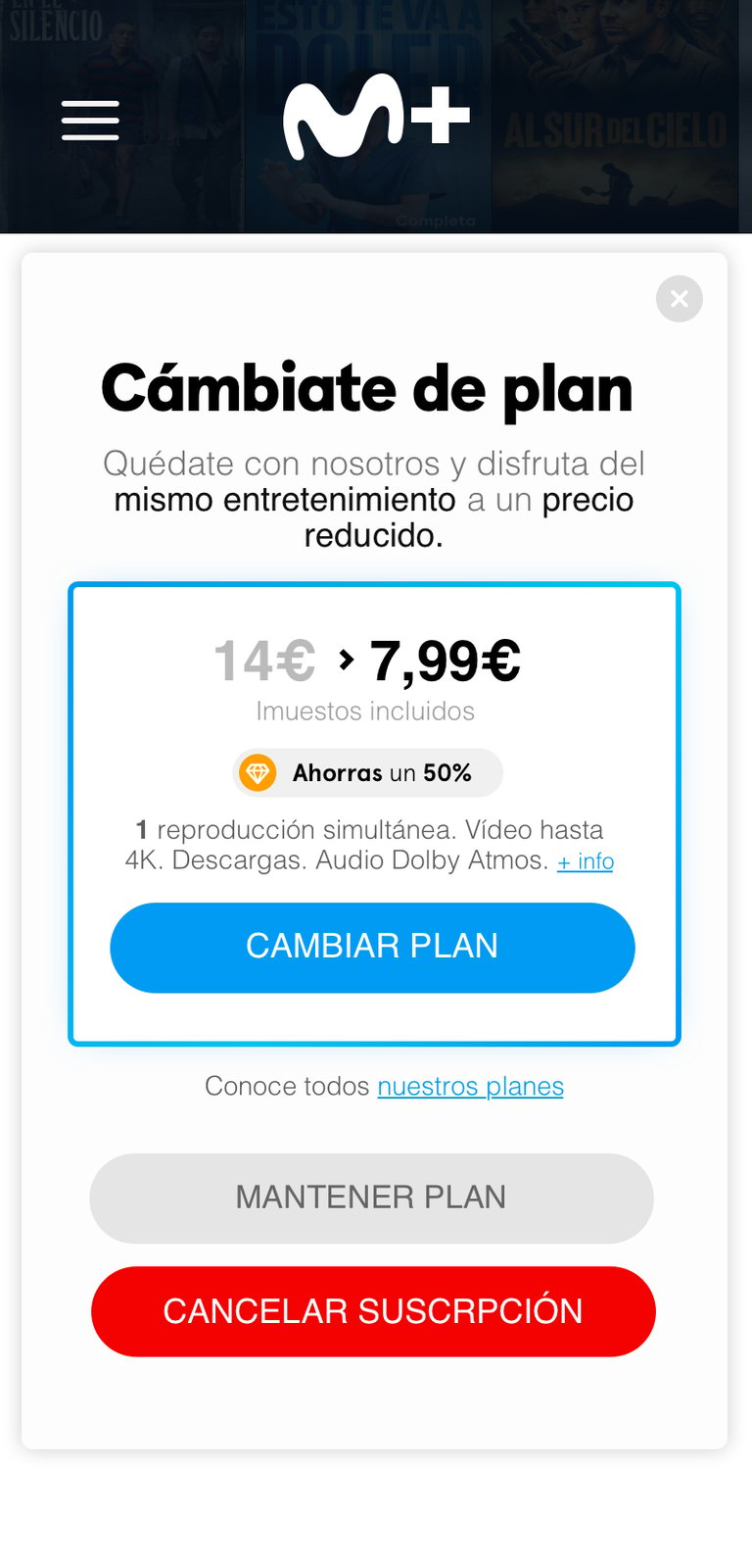
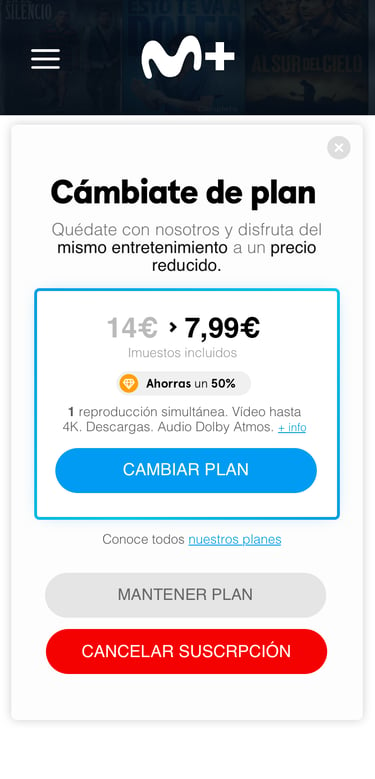
A modal window is added during the subscription cancellation process to attempt user retention by offering a discount or special offer.
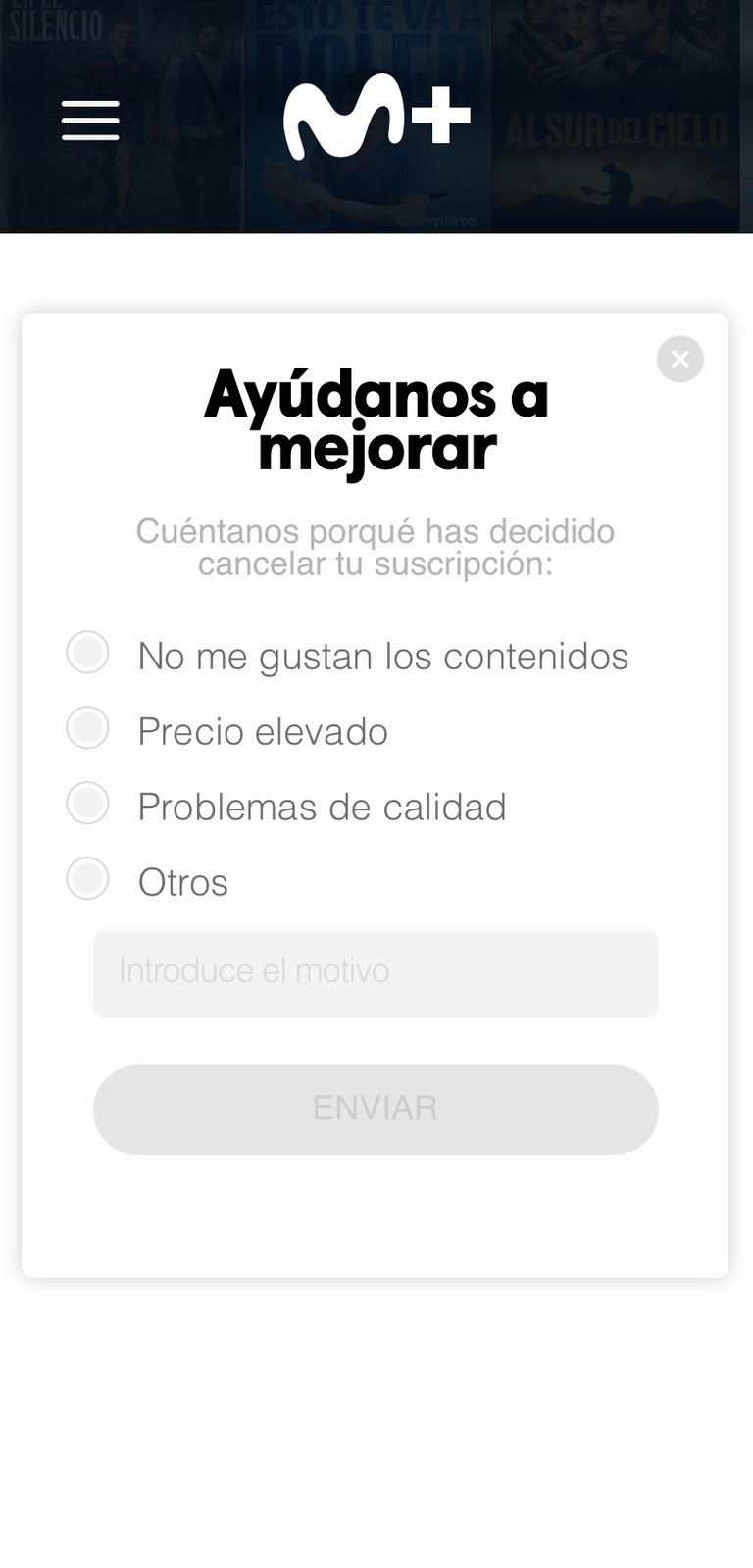
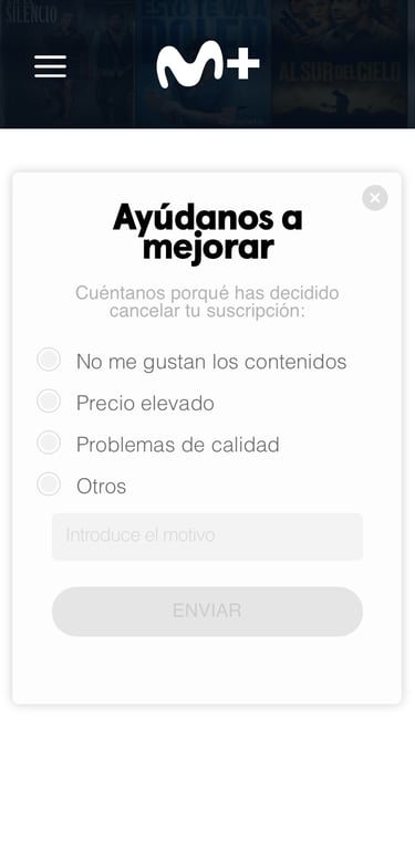
At the end of the process, a survey is presented to understand the reason for cancellation.
qualitative study...
After creating functional prototypes, an online qualitative study was conducted using the UserZoom tool to measure design usability and gather user feedback before the launch.
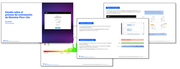
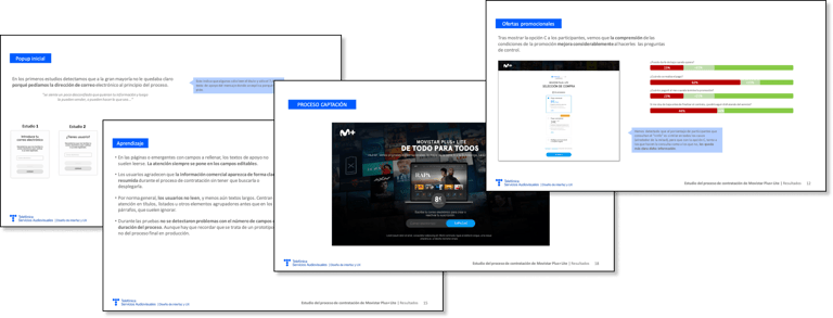
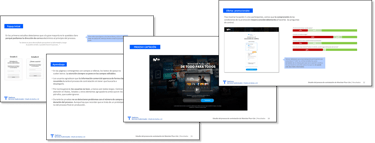
Some pages from the final report of the conducted studies.
Corrections / Adjustments...
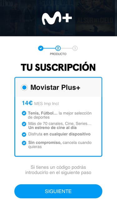
Based on the results obtained, errors and areas for improvement were corrected, and a beta version was launched to gather metrics and identify potential backend issues.
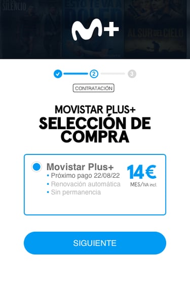
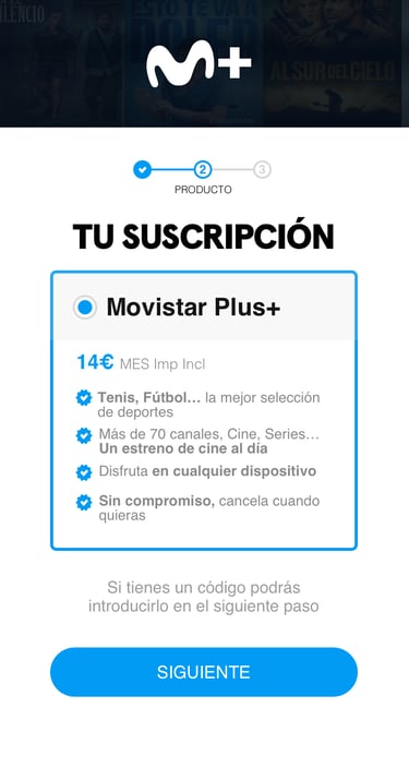
Removed the text "Next payment" since no payment has been made yet, which caused confusion.
Reduced the price size (to avoid overwhelming the user) and increased the visual emphasis on benefits (using lower contrast).
Replaced the header with "Your subscription" since, as of now, no other purchase options are available.
Informed users that promotional coupons can be redeemed in the next step to prevent them from assuming the displayed price is final.
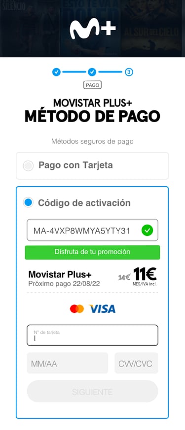
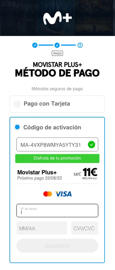
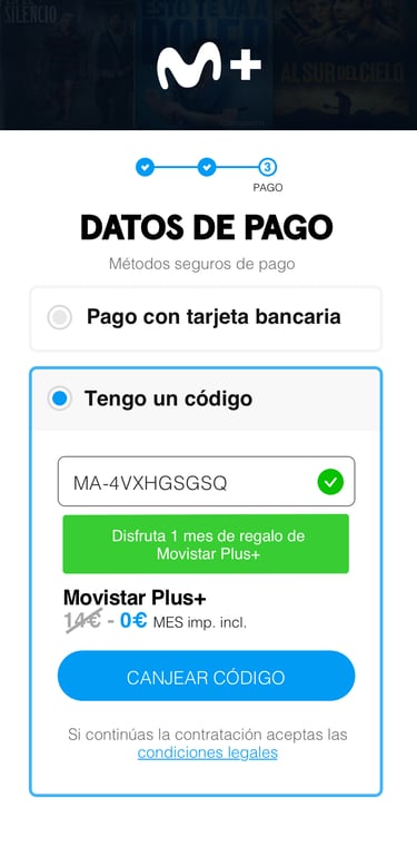
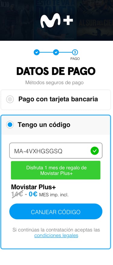
The "Next payment" text was removed to avoid confusion, but the payment frequency reference remains in the confirmation text.
Increased the original price (before discounts) to highlight the value of the promotion.
Modified the confirmation text to clarify that the discount is not a one-time offer.
Stopped requesting payment details for future renewals when redeeming codes.
Reinforced messaging to assure users that the process is secure, enhancing trust.
Improved text clarity for better comprehension.
results & metrics...
SUS
A+
Very good (A+) rating on the System Usability Scale (SUS).
NPS
+25
Increase of 25 points in the Net Promoter Score (NPS).
CHURN
-2,3
Reduction in the churn rate.
Increase in landing page traffic.
+135%
TRAFFIC
All the objectives defined at the beginning of the project were achieved, with metrics and sign-up numbers that exceeded initial expectations. Nevertheless, it is a living project that continues to be evaluated and improved.
Lessons Learned...
The involvement and commitment of stakeholders were key to the project’s success.
It’s important to have flexible design sprints that adapt to the team's workload.
Continuous measurement and A/B tests were crucial in fine-tuning the final product experience.
© Copyright Rogelio Casado 2025. All rights reserved.

